I play a very, very long game as a collector and toy photographer.
I have shoots planned based on collectables that are a two year pre order wait.
I even have shoots planned from four years ago that rely on pieces I don't even know will be released.
As waits for shoot ideas go, this was a long one.
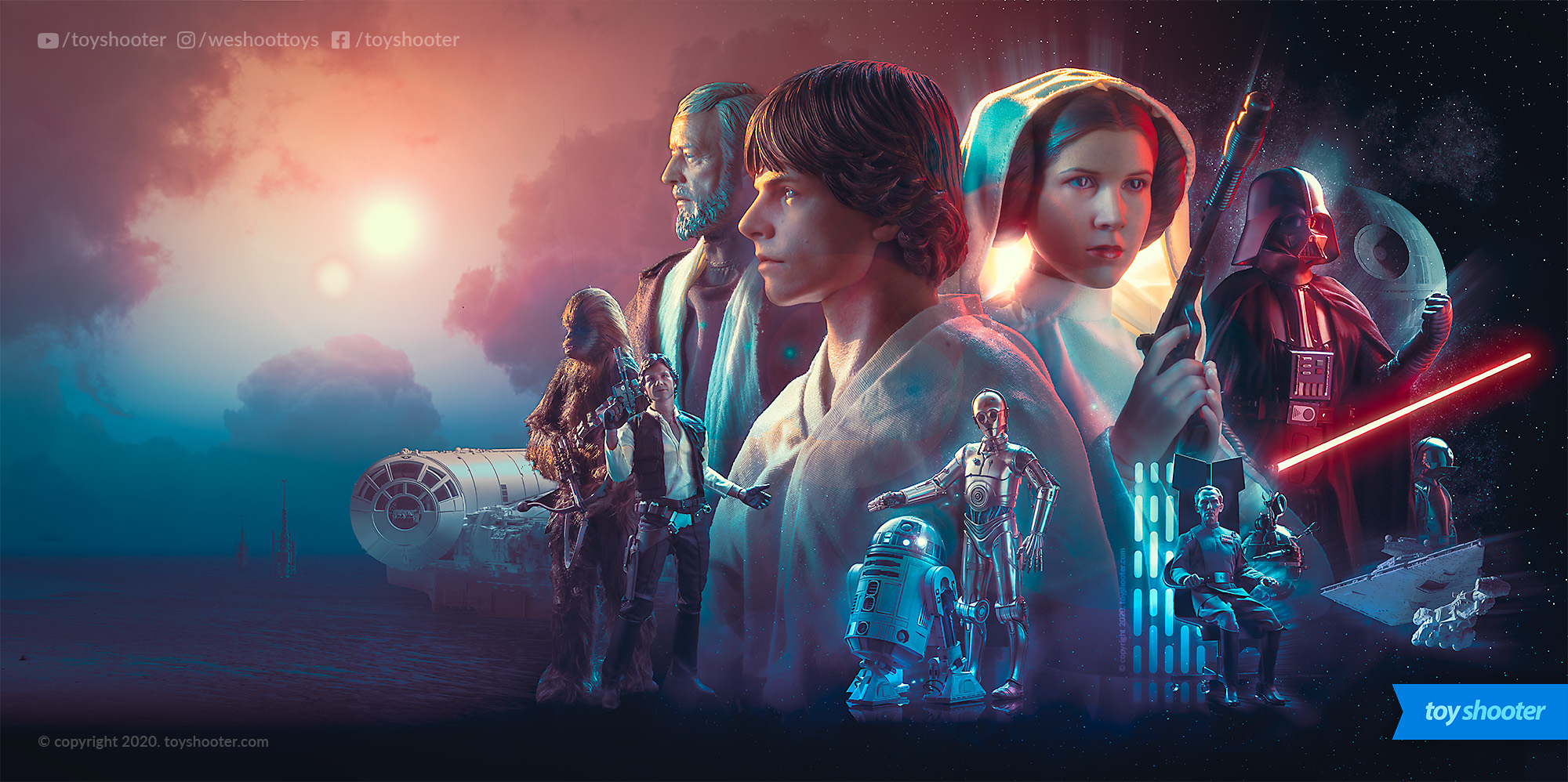
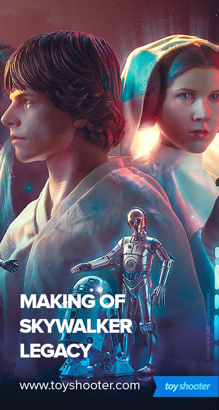
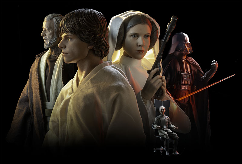
I've slowly amassed the main characters from A New Hope by Hot Toys over the years, knowing this would lead to a composite of the core characters.
All that's really missing is a storm trooper, and although I have some from other manufacturers (Sideshow, Bandai), their helmet sculpts don't touch the Hot Toys releases.
C3PO is actually a Sideshow piece and it's really good, so I can't see me replacing him unless Hot Toys knock it out the park with their release (spoiler: they probably will).
R2 was actually the last piece of the puzzle - I had the deluxe Sideshow one with the holographic Leia table (actually a very cool accessory) but the quality of the Hot Toys R2 is several levels beyond. Like Vader, and Leia before him (and Fett), I sold eBayed the older Sideshow 1:6 figures and upgraded them to their Hot Toys counterparts :)
I got all the pieces direct from retailers, getting Leia about a month before Carrie Fisher died, after which she sold out and shot up in price on the after market - it's unquestionably one of Hot Toys' best head sculpts.
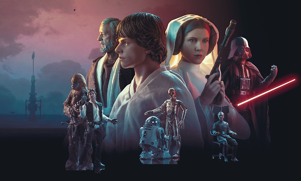
Mixed in with the Hot Toys figures are Bandai models for the Falcon, Star Destroyer and Tantive IV. The Falcon is still a work in progress paint wise though that doesn't affect this composite. Hell, I literally threw together the Tantive IV from the plastic sprues and shot it just for this piece - it's not even primed.
Tarkin has a light silouette from one of Galatic Trading Post's space wall pieces, and the moisture evaporators in the desert are a Hasbro piece from a few years back. Finally the shot of the Death Star is the real thing from starwars.com
Lastly as a bit of an easter egg, the clouds are a photo I took some years ago of a storm here in Sydney - I've used this same photo again and again in multiple pieces over the years - head to the gallery and see where else you can spot this!
There's enough there to make it work. I may come back at a later date and add Storm Troopers, TIE's and X Wings but it's good enough for now.
Composition Theft
Truth is, I wanted to develop a long banner length composition for use on the site and elsewhere, so I knew at the outset this one was gonna be wide.
As with all my compositions, I keep a reference library of comic covers, movie posters and other pieces as inspiration to draw on when starting a new piece.
Not gonna lie - the composition was heavily inspired by this promo art for the Witcher Thronebreaker:
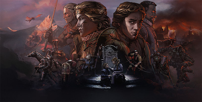
There's multiple elements to this art that I like which you can clearly see influenced my piece.
Let's pick it apart so you can understand what I pinched from this and why.
The thing I like the most is how the bigger characters are rendered with motivated lighting to the environment they're in, and this blends across the piece from one completely different environment to another. Look at Geralt and the queen - clearly lit by sunset/sunrise from the left, as are the mountain ranges, and notice how that light casts the shadow from the queen's head across the face of the character next to her. On his side, that volcanic, darker tone creates those red rim lights which also cross back onto the queen's head - this is immaculate, intrinic stuff.
Along with this light rendering, the color pallette used in this piece is earthy, restrained and consistant. The tones are gorgeous and integrate across the piece.
Notice how as well as the piece being split in two horizontally, it's also split vertically - the top half with the bigger characters is rendered in warner tones, while the bottom half with the smaller character vignettes have cooler tones, with slightly higher contrast in the center. This is part of the trick in mastering compositions - look past the actual art work, brush strokes and character detail and notice how things are arranged with size, light, color and contrast. The best artists use all these tools deliberately.
So it's pretty obvious how I've applied those concepts to my final piece, but how did I get there?
Planning
To begin with, I literally dragged the Witcher piece in photoshop and had a think about how I could arrange the characters I have to work with in a similar layout. Will the lighting choices work? Do the character relationships work?
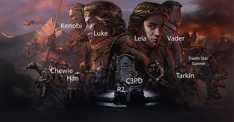
Initially I thought about a straight light side / dark side split but Vader is quite hard to light well (black, reflective, angular) and Leia's head sculpt was screaming to be a main feature. Like all composites it's a jigsaw puzzle and you always end up having to minimize certain great characters (Han in this case) to prevent crowding - compositions still need focal points.
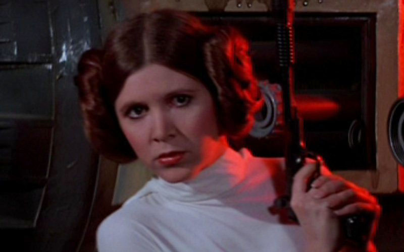
Character relationships is one thing, but how will the lighting affect them as well? In keeping with the tone of the Witcher piece, it's an obvious choice to use a Tatooine sunset to light Luke and Obi Wan together as a unit, then Luke and Leia as the centre point also mesh well. Moving to the right, I had thought about "heros up top villains down bottom" but given the lack of available villains on hand Vader falls into place on the right. His saber forms the red light source that illuminates Leia and Luke from the right, along with Tarkin and C3PO. I'm especially happy with lighting casts the red shadow on Leia's face, evoking the scene she hides in the Tantive IV from storm troopers with that same red lighting:
With that "top tier" in place the rest falls in place fairly easily, R2 and 3PO go together, Han and Chewie as well. The left side becomes the "hero" side and the right the villains.
Having planned all this in advance, I now know how each of these characters need to be lit and shot to assemble the composite.
Photo Shoot
Composite shoots are very quick for the most part. I rarely do much with light colors - standard white bulbs for everything since colorisation happens in Photoshop, but I knew I'd need some red light on some of the characters which would be more authentic in camera than in Photoshop, which you can see on the characters. There's a couple I could reshoot - Tarkin and the droids would benefit from a bit more red but no big drama.
When I'm shooting for composites I rotate the characters in and out pretty quick, tweaking the lights then taking a few shots to cover various exposure brackets and poses - it's always useful to have a few different options pose wise in case things don't fit together well in Photoshop. It's a pain having to go back to the shootint table if something's not working - that won't stop me though, and I did return for different shots of the vehicles for this.
I spent a bit more time with lighting Leia for this and it's really intricate, precise lighting; especially to get that shadow across her face.
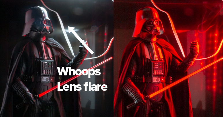
Vader is an exposure blend of a 10 second all-red lighting shot and a standard soft light shot.
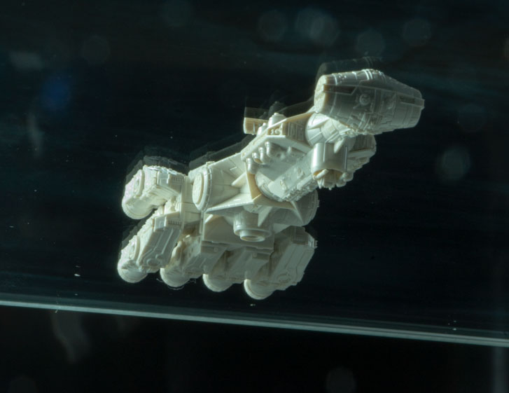
Lastly the space ships were placed on a sheet of glass and shot from underneath
I got sloppy and shot most of these on a black background, getting over confident in my photoshop masking skills for extraction.
Shooting on black is ALWAYS more difficult than green screen - it's just way easier to separate off green screen than black ... a few of the characters ended up being drawn around with the pen tool to get precise masks.
Assembly
I never, ever know if an idea is going to work at the start. There's definately "moments" where I know things are working but at the start dragging all these characters around in Photoshop to assemble the layout always looks pretty rubbish.
Two things that help - adjustment layers for black and white and an early color grade. Both of these help unify things early on and give a "glimpse" of what a the final piece might look like.
Once things start to fall in place, then I slowly work across the piece changing color tones, contrast and saturation to blend things together. It's that same work of unifying colors and areas I mentioned above about the Witcher piece.
This work isn't all done on a complete piece - I'm typically finessing areas (e.g. Luke and Leia) before I've even thought about what smaller elements will go where (spaceships etc).
Integration
Getting elements in Photoshop compositions to blend together is 90% about color and light, but various effects help as well.
Smoke, brush work and light trails all help, especially when they go across the edges of where characters meet. Good extraction work is key here as well - I like to soften the mask edges a little in Photoshop (under Select and Mask) to help with blending as well.
Finishing
You would not believe how much time I spend tweaking what could pass as a finished piece. It's easy to end up with parts of a composite that don't quite match the quality of the rest of the piece, so those parts have to be worked on so the whole piece is congruent, or it all falls part. I tweak color grading, overall contrast / saturation levels and then apply retouching to the whole finished piece.
Once done, I save a rendered, flattened Photoshop file and then produce various formats with further sharpening / formatting depending on the platform.
In Review
Hopefully without sounding too obnoxious, I think this is my best work to date.
The lighting worked out really well, I'm REALLY happy with the color palette and blend.
You can check out other compositions I've made in this gallery