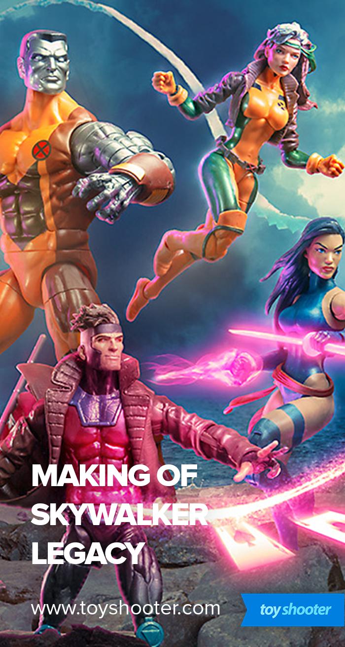
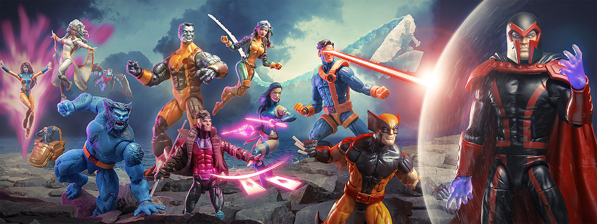
For the longest time, I've wanted to do a wide, panoramic composite.
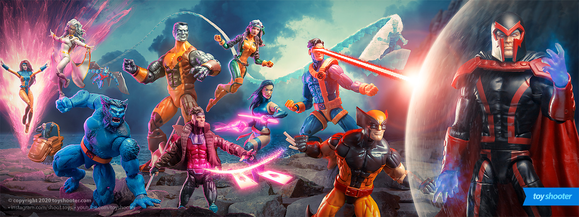
So much art in comics and pop culture is in this format there's a wealth of inspiration to choose from.
One of the most well known of these formats is the comic gatefold - a format that started out simply as a "fold out" cover to elongate it's length, and then grew as an idea to spreading cover art over the covers of multiple issues or variants.
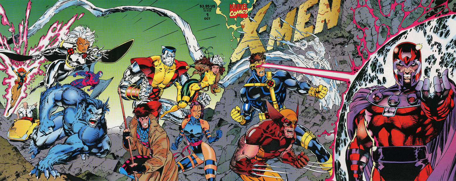
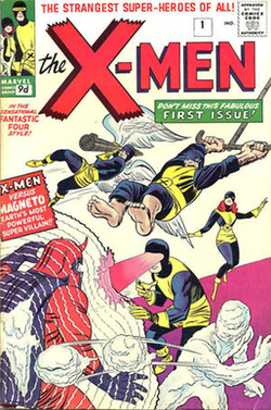
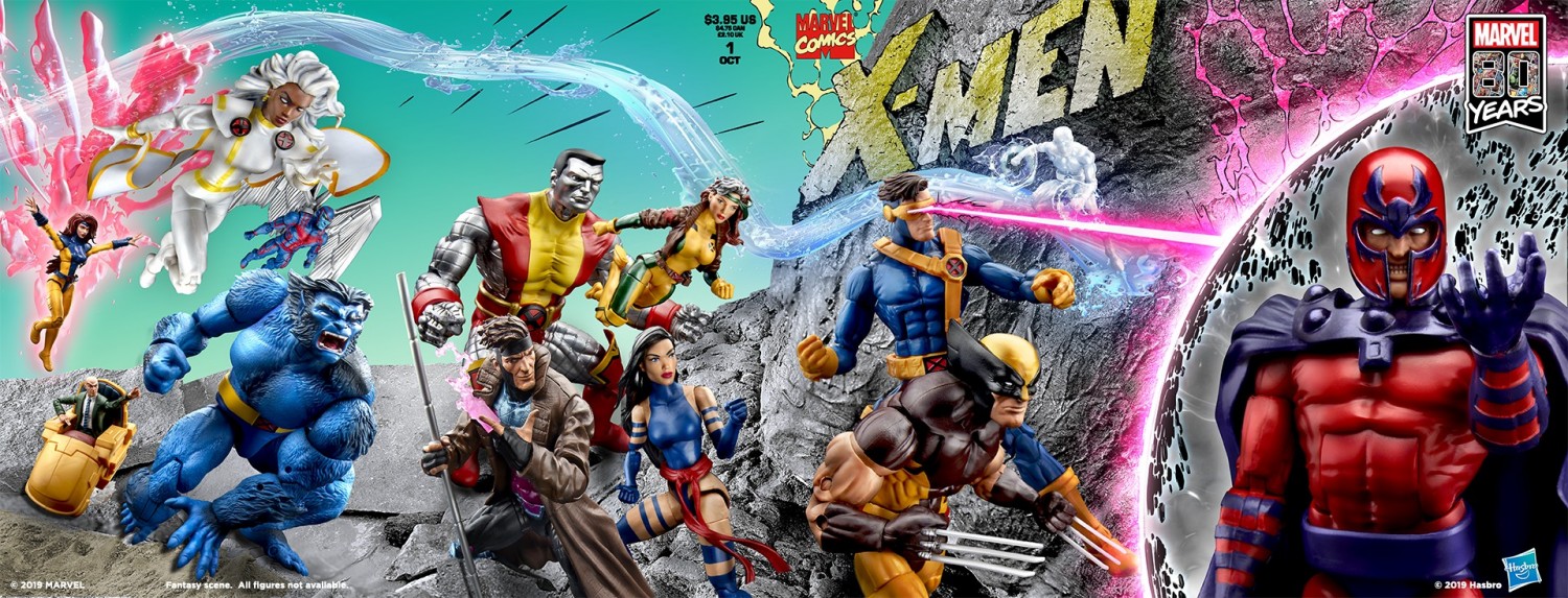
There are plenty of famous examples of this across Marvel and DC, none more so than Jim Lee's classic 1991 X-Men #1 cover variant set.
Lee's work was in turn a nod to Jack Kirby's original X-Men cover -
Going back to Jim Lee's piece, I could talk a LOT more about some of the composition secrets in it but for the time being, notice the most important aspect of creating art like this is making each "panel" work independantly as it's own cover yet unify with the whole piece.

It's a clever marketing technique because even if a reader isn't aware of the fully assembled piece, the "spillover" from characters in adjacent panels gives a clue there is more to the artwork than meets the eye.
This piece has had a couple of recent updates, which had more of an influence on mine than the original Jim Lee version.
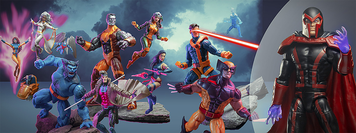
Hasbro released their own version of this as a teaser (presumably) for the release of Jean Grey in her iconic 1990's suit, which was also the last figure I needed to pull this off.
Around the same time, Sideshow released their own version in this Ian McDonald art print which has much more of an influence on my approach:
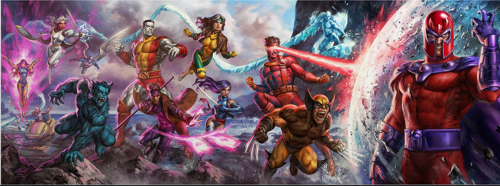
McDonald's piece renders lighting and detail much more vividly, creating a much more three dimensional version of the artwork. Ths positions, poses and emphasis of characters also change in ways that make the whole thing flow better as a single piece.
Planning
This piece was a massive challenge compared to many of my previous composites, and I knew that at the outset.
This isn't just integrating some characters bodies together, it's the creation of a whole environment from scratch and integrating the characters with it.
Since it's a straight copy of the artwork, lighting and poses are easy to figure out - I just had the art on my phone and posed each figure to match, lit them accordingly and shot on green screen.
For the environment, I had my own photos of sky and sea to use in the background, and a collection of rocks I use for photography that I laid out in various configurations and pieced together or the ground. Some of the figures (Collosus, Beast) were also propped on these rock when shot.
Photoshop
This is a beast of a shot. It's four times the size of a full size photo from my camera, measuring 14592 x 5492 pixels. Since I'm used to Photoshop starting to creak at the seams on my other composite projects, I figured this one might break it.
There's a couple of tricks to working with Photoshop on images of this scale I can share, along with something new I figured out in the creation of this piece.
First, you have to use Photoshop's .psb file format, which specifically caters for larger files.
Secondly, I also work on the characters as separately for green screen extraction and save them as .psd files. I then import them into the master composition using the "Place linked" option in Photoshop - this allows me to go back and tweak the green screen extraction and helps Photoshop optimise the image in place. It also keeps the .psb file size smaller which makes saves quicker - that becomes important as you work on these pieces.
Extending this idea, I discovered a new techinique working on this image which helped a lot.
This image has over 100+ layers. The rocks alone are 12 separate layers, Ice man's trail is a repeat of several similar images which is also 30-40 layers. Each of the characters have their own layer effects, puppet warps and liquifies, smart blurs, FX layers in front and behind them, and the whole piece has about 10 layers of color toning and grading on top of it.
All this kills Photoshop as it's trying to calculate the result of all these layers in aggregate. In the past I've dealt with this by merging layers (rastering) down to remove dynamic effects, but the better solution is when a group of layers if largely finished (e.g. Iceman's trail), you can select them and replace them with a linked file, the same as importing one of my green screen PSD's at the outset. This helps keep Photoshop relatively performant when these images get out of hand.
Lastly, take regular back ups!!
Progression
Here's some snapshots I took while working on this -
- This is pretty much the bare green screen extractions placed on the canvas, with the background stubbed in along with rough effects for Jean Grey and Magneto. It's much like a painting at this point - get the big parts in to see how it balances out, then detail in / replace as you work through it. Even at this early stage I throw a light grade on to unify the characters slightly to see where it's going.
- Here I've worked on Magneto's bubble, and photoshopped in lots of small rocks I have for the ground. These are in tiers so I can graduate light effects across them front to back. Reshot Gambit as his original pose was too out of place, and Wolverine just looked a bit shit so reshot him as well.
- Tonal work here done in black and white to adjust contrast levels across the image.
- Further color toning and start of dodge/burn across some of the characters. Start of FX work on Gambit and Psylocke, and Iceman's brutally laborious trail.
- Ice trail complete, and Jean Grey's rough FX replaced with completed work. Rock coloring under Jean and further FX work on Gambit and Psylocke. Color integration on Storm.
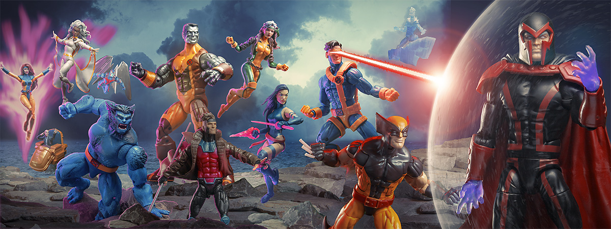
Final additions to this are the mountain behind Magneto and more detail / clean up. Scroll back up to the top for the final result!
That's it - I think I'm done with over sized composites until I get a computer from five years in the future!
Easter eggs ...
- Psylocke's hands are reversed (and thus upside down) to allow the weapons to be gripped as shown. I thought about digitally altering the hands to correct them, but art is more fun with deliberate errors.
- Ice man's trail is made up entirely of shot of the blocks of ice that came with the deluxe Rey and Kylo Black Series figs from The Force Awakens
- Gambit's coat was flared up with an A-clip behind him. You can see the bottom of it betwen his legs
- Angel's wings were shot separately from his body to create a more dynamic spread
- Rogue, Psylocke and Jean have all had their hips filled in to eliminate the unsightly gap the figures leave when articulated. I like playing up the fact these composites are shot with toys, but some things just benefit from a tweak ;)
- Once again, the sky is the same clouds shot I use in lots of my pieces, in this case repeated twice with alterations
- For the puristic snowflakes out there, Collosus and Magneto are not of course, the correct versions. I ironically had the 3 pack with the correct Magneto in it but decided to sell it, and the price tag on the Collosus / Juggernaut set is just too high for me especially as I already have the Juggernaut BAF.