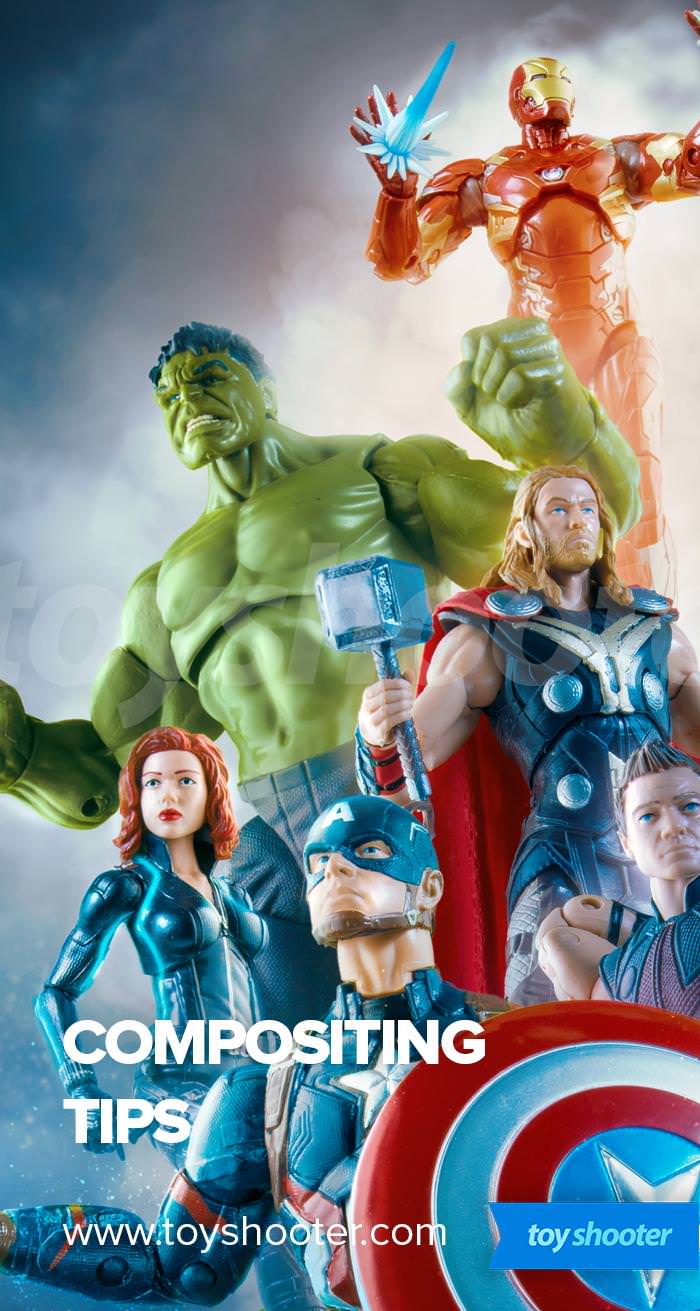
Following on from my previous introduction to Photoshop Compositing, here are some practial tips and tricks to help you create great work.
Compose in Black and White
After I'm done with green screen extraction, I import everything I want to include into one Photoshop document. All the characters are on separate layers, ready to be arranged in some kind of combination.
This is a mentally challenging part because frankly - everything looks a mess. All these separate shots look just that - obviously seperate and they don't gel. The whole job after finding a composition is really about melding everything together to unify what you've brought in and give it balance and harmony.
The first job though, is to arrange things - resize characters bigger and smaller, and move them around until things start to click.
To make this easier, the I add an saturation adjustment layer at the top of the document and dial back the saturation to black and white.
Why?
Because it's a lot easier to judge a composition without being distracted by color.

Your characters will instantly start to look more unified simply by taking the color out, and this forces you to see where parts of the image are too busy and other where more contrast needs to be brought in.
While I'm doing this, I'll make contrast adjustments to the characters while they are in black and white - usually making characters further back lighter and more washed out, and the opposite at the front.
Once you're happy with the layout, drop the (de)saturation layer and you may be pleasantly surprised with what you find.
The next stage is to recolor or color blend characters to make them join together
Think in tiers
If you have a lot of characters on screen, separate them into tiers - foreground, midground, background.
Foreground is your focus - these should have the highest point of contrast in the image, and be where your viewer's eyes are drawn towards.
Midground contains secondary characters and "filler" - stuff that fits around your foreground tier and augments it, fills in gaps etc.
Background is peripheral - faded, almost invisible elements that sit in the background and don't get in the way.
An example of this you'll see in a lot of composits is using a character's head as the entire background, usually with a focus on the eyes as the part you can make out:
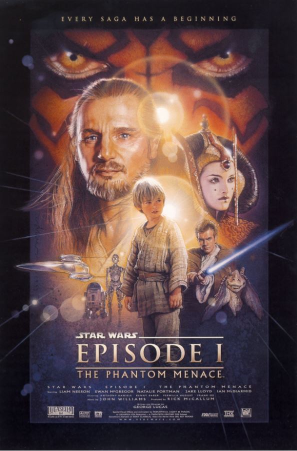
In this classic Drew Struzan Poster for The Phantom Menace; Padme, Anakin & Qui Gon occupy the foreground tier. Obi-wan, Jar Jar, The droids and the ship occupy the mid ground, despite being in front of Padme / Qui Gon. Their order in the composition hierachy is defined by the reduced contrast and saturation they have compared to the other characters. Darth Maul's face occupies the background space effectively
Working in tiers doesn't necessarily mean resizing characters on the different tiers - you may choose to mix things up, but the trick with is to always think in terms of what the primary focus of the image is. Your viewer's eye should be drawn towards one point, everything else should built towards that in size, color and/or contrast.
Don't be afraid to reshoot
For composites, I shoot with a fairly basic lighting setup, so it's easy to go back and take secondary shots (pick up shots in movie vernacular).
Many of my composites were put together to almost finished stages, when I went back and reshot certain characters to make them integrate in the scene better.
This is easy to do with non destructive photoshop editing (a topic I'll be covering more on). If all I'm doing is moving an arm or turning a head slightly to get a better fit, it's really not that much work to get a new shot, import it, apply my green screen extraction process and swap out the old layer for the new. Occasionally I may have done some work using a mask of the previous shot or similar that requires extra work, but not a big deal.

For this reproduction of The Force Awakens teaser poster, I originally built the composition up using the shot of Rey on the left. It didn't sit right because the camera was a little too low - she's looking up a little and that was obvious when placed in the composition. I made some small tweaks and re-shot her, also taking the opportunity to widen the lens out to capture the full width of her robe flying out.
Don't be afraid to meddle
The great thing about compositing is you have more flexibility over the shape of your characters than in a photo. Arm not bent enough? Photoshop's liquify and puppet warp tools can push things around to your needs. That's less easy to do in a photo where those tools will warp whatever is in the background as well. With composites, it's easy to make small adjustments.

Here you can see an in-progress snapshot of the same Force Awakens composition. Notably, you can see Rey's arm looks kind of "fat" - something I tweaked with liquify for the final composition. You can also see the color grade is a work in progress, and where I used a temporary star field background off the web to quickly mock up the composite before swapping in my own hand made version.
Got Questions?
I've got a lot more to cover on build compositions with Photoshop. In the mean time, feel free to ask any questions you have using the comments below: